Thursday, 20 February 2014

High Expectations - final draft


When presenting our first draft to the rest of the class we were given the following negative responses for our film, and areas which we were advised to improve:
  • No voiceover
  • A line should be put in place to split the screens better at the beginning
  • It should be shorter (less than 2 minutes)
  • Use a more appealing colour and font on the titles
  • Include the production company logo and film title
As you can tell in the final draft, we have included a voiceover from one of the main characters, Charlotte, who explains life with her best friend Grace and how she wants to be popular in school. We have also inserted a black line down the middle of the screen to show the split screen more clearly to the audience. We had to do this through finding an image of a black line and transporting it onto Final Cut Pro using photoshop. We have taken out a few of the shots that were previously in the opening scene and we have also trimmed a few of the shots in the title sequence using the blade on Final Cut Pro. This means that we have managed to reduce our total title sequence and opening scene time from 02:22 to 02:00, which was our target. 

We previously used a sans serif font with plain white text colour for the titles and we were advised to change this to make it more appealing for the audience. We have done this and now some of the titles are pink while others are still white, but we have also changed the font so now it looks more like fancy handwriting which is something that a female teenage audience would find much more appealing. We have also included the production company logo as well as the movie title which we added in using a fade transition to make it appear and disappear on the screen more attractively. We also decided to insert an arrow pointing at Charlotte when she introduces herself in the voiceover. This is to assist the understanding from the audience's point of view, and it also makes the overall appearance of the shot more appealing.

Saturday, 15 February 2014

Evaluation Task 7 - Progression from preliminary task to feature film opening

Grace and Charlotte at school

Mise-en-scene

The image on the right of Grace and Charlotte at school is a very good example of how we used mise-en-scene to create a noticeable school environment / setting in our feature film. This long shot (which becomes a pan shot) allows the audience to first of all notice the lockers. This is a convention of teen angst films as they are commonly found in schools - films like Easy A and High School Musical include lockers at some point. We didn't consider mise-en-scene as thoroughly in our preliminary as it didn't seem necessary at the time. However when watching the preliminary task back, because we didn't consider things like the setting, the situation or story line wasn't very clear as the conversation was very vague. In both Grace's and Charlotte's bedrooms at the beginning we made sure they were both iconic and represent a stereotypical teenage girl's room by including accessories and things like mirrors and wardrobes in the filming, which was another thing we hadn't considered in our preliminary task.

We represent a generic teen angst genre by including certain props like the school books which are passed to Charlotte. This is also another feature that the teenage audience will recognise and will make them feel more comfortable knowing it's a school setting. Grace and Charlotte are also dressed very fashionably which connotes their popularity and their effort to make themselves look good, which is a stereotype of teenagers as it shows they care about their appearance.  However, clothes and props were not important in our preliminary task as it was just based on two people having a conversation, therefore the personalities and stereotypes were not needed to be focused on. 

We learned before our preliminary task that high-key lighting needed to be used to represent a positive atmosphere, and so we ensured we used high-key lighting throughout the preliminary task to connote this effect. We used a similar approach in our feature film and we were very cautious of where we filmed to make sure that we used high-key lighting throughout the film. This connotes the positive atmosphere and sets the mood for our audience.

Use of titles
Use of titles in our feature film

In our preliminary task we didn't use any titles as they weren't really relevant, and we only had an hour to complete our task. This made it challenging to include titles in our feature film as we weren't sure how to do it at first. However, Final Cut Pro is quite similar to different softwares that we've used before and so we got used to it after a while. We used pink text in a serif font for the subheadings (i.e. music and sound by, edited by, producer etc) and then we used the same font but white coloured text for all the names. This was purely to offer a bit of variety in the titles so they aren't all the same colour. It also made the titles look a lot more appealing compared to when they were just white coloured sans serif block styled text in our first draft. The reason for using the colour pink is because it is stereotypically a very girly colour and it is used a lot in teen angst films (e.g. Bratz). The colour pink also connotes love or relationships, which is important as the main characters face certain relationship problems in our film. The use of theserif font was purely to make it more appealing. It looks more attractive if it is in that font rather than sans serif which is very basic and dull - the serif font looks like a girls handwriting and so the audience can relate more and find it more appealing.

In terms of positioning of the titles, we tried to add them in the lower-centre of the shots so they aren't in the way and the audience can focus more on what the characters are doing. We also added in titles that move onto the screen, like the one in the image above. The title wipes from left to right trough the use of transitions, meaning it almost follows the girls through the door which is another thing we experimented with to make the titles more appealing.

Framing


Poor framing in our preliminary task
In our preliminary task we did not focus on framing at all well an we made a few mistakes in some of the shots. As you can see in the image on the right, there are things like bags, folders, posters etc that are in the shot when they shouldn't have been. This can draw the attention of the audience away from the characters and on to those objects which is not what we wanted as it is unwanted background.
In our feature film we learned from these mistakes and made sure we only included what was relevant and what appealed to the teenage target audience. Everything we included in each shot was in there for a reason (like the accessories in the bedrooms, the lockers and posters at school fitted the setting).

Camera shots


Long shot in High Expectations
In our preliminary task I learned about using a variety of different shots. We used a range of different camera shots such as pan shots, mid shots, close-ups, long shots and i learned about the 180 degree rule. The 180 degree rule is when the camera stays at the same side of the action at all times. This is to avoid confusion with the audience so they always know what is happening, as if the camera kept moving positions then the film can be quite difficult to follow. We used the 180 degree rule in our preliminary task however it wasn't needed in the High Expectations film as a lot of the filming was in different settings so the rule wasn't relevant.

One main improvement we made in our finished product was the steadiness of the camera. In our preliminary task the camera was quite wobbly and this was distraction to the audience, we achieved a more steady camera with the use of a tripod, which avoided the feeling of 'mayhem' if the camera was wobbly. We used a range of shots in our finished product such as mid shots, long shots, pan shots and extreme long shots. We used mid shots and pan shots most commonly and they improve the flow of the film. Pan shots were used to watch someone walk past and this is so the audience can see it from other character's POV. We used long shots and extreme long shots so the audience can see what clothes the characters are wearing. This relates to the representation of social groups as what clothes the characters are wearing can suggest what their 'social status' is in school.

Editing
Editing in High Expectations
There was a lot of work in terms of editing that we completed for our finished product and the preliminary task. Our preliminary task was mainly for the editing process, to get used to the Final Cut Pro software, as it is different to other softwares we've used before. In the preliminary task our only concern in terms of editing was arranging shots and cutting them so they are in logical order. We didn't include titles or shapes on the screen like the example of editing in High Expectations on the right. However, the preliminary task was very helpful in learning how to edit using Final Cut Pro and this benefited us in the editing process for our finished product (High Expectations). 
Black line to split the screens
Due to our previous editing experience in the preliminary task we were able to make the editing process quicker than it would've been before hand. We used a range of different editing techniques in High Expectations and we included a lot on the screen to make it more appealing. As I have explained before, we added in titles through editing on Final Cut Pro and we gave them transitions to make them appear on the screen in a more appealing way. I used Photoshop to include certain shapes in our film such as the pink arrow in the top picture and the black line to split the two screens in the picture on the right. The black line was used to split the screens so the audience can see how both Grace and Charlotte get ready for school. It is a feature that consists throughout the entire title sequence and is a convention of the teen angst genre and it used in other teen angsts like Bratz. . It helps the audience immediately understand that these two are the main characters and it represents their 'social status'. The pink arrow was purely added in to help assist the audience's knowledge as in the voiceover in the opening scene Charlotte addresses herself, so the arrow points at her at the same time she says 'Hi, I'm Charlotte.' 

The voiceover is the first example of non-digetic sound that we included in the opening scene. We included this so that the audience are aware of who Charlotte is and what role she plays in our film. It also is used to inform the audience on what kind of film this is and what the general storyline is about. Another example of non-digetic sound in our film is the song that we included called 'Step To The Grind'. This is non-digetic sound as it is sound edited in and sound that the audience cannot actually see in the film. The last example of non-digetic sound included in the film is the sound of the alarm at the beginning of the title sequence. This was also added in as neither girls had an actual alarm at home and it felt like a good way to start the film as it is something the audience can recognise and maybe relate to - as it symbolises getting up early for school. It is also included to assist the understanding of the audience, if they hear the sound of the alarm they immediately understand that it is the morning, and then the story begins to make sense after that.

Monday, 10 February 2014

Evaluation Task 6 - What have I learnt about technologies from the process of constructing my product?

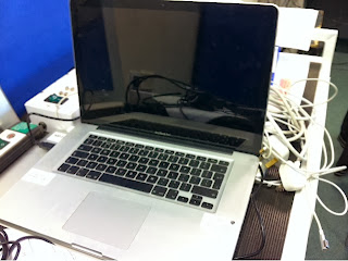
Mac Book
During the construction of my product we used a Mac Book which was used for editing our film using Final Cut Pro. I learnt certain editing techniques such as transitions (i.e. the wipe transition) that I hadn't learned how to use before as Final Cut Pro was a programme I had not used before. I used these transitions on the titles to make them appear on the screen in a more appealing way rather than just having them appear on the screen automatically. This made the film a lot more appealing for the audience. I also used the Mac Book to transfer images from the internet onto Final Cut Pro through the use of Photoshop. Images such as the arrow that I use in the opening scene in the school setting. This was something I hadn't done before and it benefited the end product as it assists the audience's knowledge of who is speaking in the voiceover. I also used the Mac Book to store back ups of my product. This was very important as if any of our work had been deleted and we were unable to get it back we would have to start again.

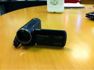
Panasonic HD Camera
I used a Panasonic HD camera to film our product and before the filming of our product I learnt about how the use of different shots can be used to help create a representation of our characters. For example the use of a pan shot or a mid shot are commonly found in teen angst films I learnt to use both of these shots effectively for different purposes. The pan shot for example was used to show the audience the setting / surroundings the characters find themselves in and this helps them understand the genre of the film (i.e. in the school setting / location). The mid shot for example allows us to create a representation of the character and allows the audience to assume what sort of personalities are present with each character by focusing on their costumes and facial expressions - which allows them to assume stereotypes.

Tripod

The use of a tripod was very effective in the making of our product, especially when using a pan shot as it helped keep the camera still as opposed to if we tried to do it with a handheld shot. The tripod wasn't something I'd used before and it was helpful in creating the perfect shot as I could adjust the legs on the tripod to the perfect height and this helped me exclude any unwanted background. As mentioned it was also helpful when using a pan shot as the camera stayed still, and this helped us avoid creating the effect of 'mayhem', as if the camera was wobbly then it would create this effect for the audience and it would take the audience's attention away from what is happening in the shot.


Voice recorder
Like the tripod, this voice recorder was one that I hadn't used before so I learned first of all how to use it by recording the voiceover of our film and then transferring it onto a Mac Book. I learned how to transfer it on to the Mac Book and save it in a file that was easy to find so I could use it in our product. The use of a voice recorder was very beneficial to our product as it enabled us to include a voiceoever. This is important as voiceovers are a convention of the teen angst genre and without a voiceover the title sequence and opening scene wouldn't really make sense. It is also important that we used  voice recorder to include a voiceover as it makes the opening scene more interesting and sets up the story for the rest of the film - and it also allows the audience to create an opinion on Grace.

YouTube logo

YouTube is another example of how I used technology to benefit my product. I had never uploaded anything onto YouTube before and this is something that i learnt after creating the first draft of our product. Learning how to upload our first draft onto the internet was very useful as it allowed me to show our product to a global audience, which means a lot more people are going to recognise it and give us feedback. Uploading the first draft onto YouTube meant we were able to make changes to our product based on the feedback and comments given to us by audiences. As YouTube is a website used by a lot of our target audience (13-18 year old girls) it allowed us to present our product to the type of audience that we want to attract.

Phone
I learned how to use a wide range of properties on my phone which was very beneficial to the product, and this is called technological convergence. I used my phone first of all on the internet by sharing the first and final draft of our product on social networking sites like Facebook and Twitter. This allowed me to share the product with people who fit the target audience of 13-18 year old girls as they are the main age range that use these social networking sites, this again meant we could receive feedback from the age range that fitted our target audience, meaning we could change our product to make it more appealing for the target audience. I also used text messages on my phone in order to assist teamwork as I discussed with other members of the group what the next step was in terms of improving our product, and this was very beneficial. 

Blogger logo
Over the course of this school year I have learned how to share posts on Blogger, and this has been very beneficial for my product. I have used Blogger to share with everyone the work I have completed towards our end product and this has helped me recognise my own progress as well as realising where I need to improve. The first draft of my product was posted on Blogger and I received feedback from my classmates and this was very beneficial to our product as we were able to make the changes pointed out to us and improve the overall film. This was particularly effective as my classmates fit in the target audience and so we were able to receive feedback from them and make it more enjoyable for people inside the target audience for our film.
PowerPoint logo

I used PowerPoint to create the 9 shots post for my blog, This was very helpful and it was something I hadn't done before. I had to import 9 shots from my product and put them all into PowerPoint, making a collage of them by 'grouping' the images, before then saving them as one large image and saving it into the computer. I did all this before uploading the image onto my blogger for usage. This was something I learnt as I hadn't done it before, and this was very beneficial to my own learning and understanding of my product. It helped me review the shots I had used in my product, making it easier for me to see if I had used a wide range of shots or not.


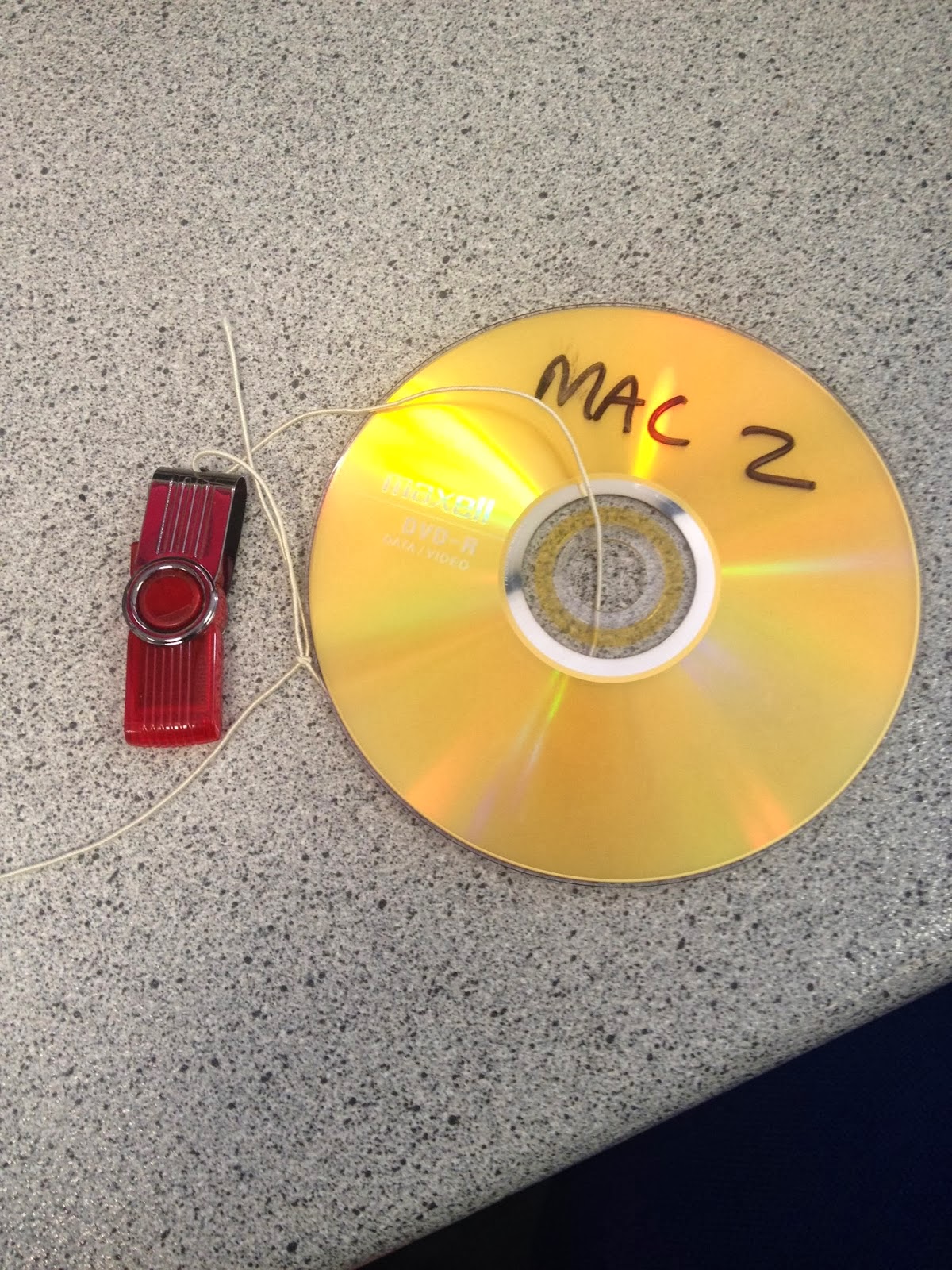
Memory Stick
A memory stick was another example of technology that I used to assist the production of our film. First of all, I had to choose a song from freeplaymusic.com called 'Step To The Grind' and this is the one we wanted to use throughout the title sequence / opening scene. This song had to be transferred onto the Mac through the use of a memory stick. I also ad to use the memory stick to include other sounds in the film such as the alarm clock sound in the title sequence of the film. Lastly, I used a memory stick in order to transfer a pink arrow image from a different computer onto the Mac after cropping it in Photoshop. The use of a memory stick was very beneficial in the making of our film and without it we would've struggled as it was made much easier with a memory stick.

Gmail logo
Gmail was very helpful during the whole process of my film and I used it on my phone as well as the computers at school and at home. I created a Gmail account at the beginning of the school year and in doing that I was automatically given a created YouTube and Blogger account, and these two sites were very helpful in the making on my film for the reasons given above. Gmail was also useful for teamwork purposes as I could discuss problems faced or areas for improvement with my group members on Gmail. I could also use Gmail to share the first and final draft of our film with the rest of the media students in our class and this helped with feedback as a lot of them watched it and told us how we could improve.

Wednesday, 5 February 2014

Evaluation Task 5 - How did you attract / adress your audience?


The video must be played on the YouTube website otherwise the annotation boxes can't be seen fully and therefore a lot of text is lost on Blogger.

http://www.youtube.com/watch?v=hqEp-O-2bOk

Above is a YouTube video that I posted including annotations on how I managed to attract my target audience. It includes annotations on each shot explaining how each shot appeals to the target audience. Putting this video on YouTube is helping me attract a global audience.

Saturday, 1 February 2014

Evaluation task 4 - Who will be the audience for our media product?

Audience profile

Likely audience

Questionnaire

I decided to construct a questionnaire and ask students the questions on it from my media class. This is because the two people I chose to question are 16 and therefore fit into the target audience for my film of 13-18 year olds. I decided to question a male and a female student so I can use their results to show why I have chosen the target audience that I have by comparing their answers along side another, this fits in to demographics and psychographics. Below is the questions I asked and the answers of the male and female students:

1. How old are you?
M- 16
F-16

2. Where do you live?
M- Eynesbury
F- St Neots

3. Favorite film genre?
M- comedy or action  adventure
F - romance or comedy

4. Favorite hobbies?
M- playing football and video games
F- socialising with friends (shopping or getting coffee)

5. Do you prefer blockbusters or low-budget films?
M- blockbusters
F- I enjoy both

6. What do you spend most of your cash on?
M- video games or clothes
F- clothes

7. Do you have a part-time job?
M- No
F- Yes

8. What would you like to do after sixth form?
M- I'm not sure
F- Go to uni

9. What clothes do you like to wear most? (casual/smart/)
M- casual
F- casual

10. Do you enjoy teen angst movies (if yes, why? if no, why?)
M- No. I enjoy films more based on action rather than films based around school life. I don't find teen angst films very enjoyable
F- Yes. They are fun to watch and can also be quite funny. I enjoy watching them as I can relate to them more as well as generally characters in teen angst films are ones I can compare to people I know from my school.

Demographics

Age: The age for the target audience of my film is 13-18 year olds.
Class: 'High Expectations' is aimed at middle class / working class and is generally aimed at people who like to socialise and be around peers a lot.
Gender: The film is mainly aimed at 13-18 year old girls, however it does contain some interests that may attract a male audience.
Geographical location: As the film is based in England and includes a full English cast, the geographical location of the audience would be England, but no specific area of England.

I feel as if the target audience is clear in the title sequence and opening scene of my film and we would be sure to represent this well in the advertisement of the film in order to attract the right audience. Teenagers will enjoy my film a lot more than adults purely because they can relate to a lot of the situations and scenarios in during the film, and also the two main locations / settings are at home and school; which are the two locations teenagers are most familiar with. The problems faced in the film (i.e. bitching, popularity, arguments, relationships etc) are all problems faced by teenagers in every day life more so than adults. However, because the adults don't experience these problems in their every day life they may find it quite immature and humorous so they would still be able to enjoy it even if they cannot relate to it. The reason for discussing these two types of audiences is they are most likely audience. Teenagers would be the most likely as they would be more attracted to watch it, however a parent may watch it too, for example when taking their daughter to watch it at a cinema.

Psychographics

Interests: The target audience for my film would have certain interests like fashion, socialising, pop music, teen angst films such as romantic comedies, and would also have an interest in make up or other accessories as the target audience is teenage girls. These are all things typically linked with teenage girls and also things very commonly found in teen angst films and so they are things the teenage audience can relate to an can also recognise from other films they enjoy. Whereas a teenage male audience would have other interests such as sports, gaming, films that involve violence and will generally interested in a much different type of clothing. Even though some of the problems faced in my film are ones a male audience may be able to relate to, it isn't something they would particularly be interested in watching in a film because they show a lack of interest to those problems, as opposed to a female audience that would find it a lot more interesting and therefore is more likely to enjoy the film.

Beliefs: The film's purpose is to try and appear as a true story based in the setting of a school environment showing a typical 'popular' teenage girls daily life and what happens to her throughout her school life. The idea is that the audience will feel as though they can relate to the situations Grace and Charlotte face throughout the film and it will make them feel more comfortable as they can relate from personal experience. Through making the audience more involved it will give them an opportunity to relate to the film more by matching characters in the film with people that they know and see every day in their own school lives.

Values: In my planning I have used a wide range of shots to connote the different stereotypes and make the clear to the audience without any dialogue needed. For example the use of a low angle shot when the characters are walking down the stairs, it represents how they are popular because they are 'higher than everyone' - however it also connotes that they are coming back down to reality in the film when they face certain challenges in the film, which is why the audience see then come down the stairs. I made sure to include upbeat and cheerful music as it is typically very girly music and something the audience would enjoy. It also connotes the characters popularity and 'bubbly' personalities. The catchy music means it will hopefully stick in the audiences heads and it will remind them of our film meaning they are likely to tell other people about my film. It was important to use a wide range of shots as well as catchy music in the making of my product to make it more successful.

Tuesday, 28 January 2014

Evaluation Task 3 - What kind of media institution might distribute my media product?

https://www.youtube.com/watch?v=ovRCHNuxtP8

For this task my group need to produce a directors commentary style voiceover during a quick discussion of our film, which should last about two / two and a half minutes. At the moment we haven't been able to produce this voiceover however we all have our notes completed and it should be completed soon. We have each allocated each other different discussion points to talk about in the voiceover and we should each talk for about 30 seconds. I have been given the following two points to discuss: 
  • The information given on posters and trailers
  • When the film would be released
Here is what I have structured for those two talking points:

What sort of info would be on posters and trailers?
The information given on both posters and trailers will consist of the film release date, production company, the film director, film title, an iconic image from the film, star ratings from chosen audiences, quotes or reviews from chosen audiences, a movie slogan, names of the main characters / actors, and on the trailer there will be a voiceover about information on the story line to influence the target audience to watch our film.

When would they release your film?
An ideal release date for High Expectations would be beginning - mid August, this is because the target audience is 13-18 year old girls and as this target audience is still at school / in education, this release date will mean they will be available to watch it as it will be the summer holidays. Another reason for this release date is that it is relatively late in the year and so has a higher chance of being nominated for film awards in January. 

So the release date of beginning - mid August will increase the number of people in out target audience available to watch it as well as increase it's recognition and popularity, meaning it's more likely to be successful. 

Below are the other talking points in the voiceover that the other members of my group will discus in the voiceover:

Which company would distribute your film?& What else have they done that is similar to yours?
We have chosen Momentum Pictures to distribute our film. They release around 20 films a year and commonly distribute other romantic comedies and teen angsts such as Safe Heaven, The Accidental Husband and P.S I Love You, which have all been very successful and very popular with our target audience of 13-18 year old girls. Another reason for choosing this company is the high success rate of the films distributed by them, they are usually ones that go on to win awards like the BAFTAs and Oscars, and this would be the type of success we want High Expectations to achieve.

What is the USP of your film?

The unique selling point of our film is that it is a film made and based in England, which is a countertype of teen angst films as they are generally based in America. We used a full British cast as it is based around a school in England and this helped us portray school life for British students, and this will differ in comparison to students in America. Our film is similar to other teen angsts such as Easy A and Mean Girls. This is clear because our film's centre of attention is on the 'bitchy' and 'popular' girls in school, and not based around the awkward and less popular teenagers in school like The Perks Of Being A Wallflower is. Therefore we would be more likely to attract an audience that liked films such as Easy A and Mean Girls.

What marketing methods would they use?
The main marketing method we would use is social network websites such as Facebook and Twitter, and we would also use YouTube to advertise the film. The reason behind using social network sites such as Facebook and Twitter is because these sites have a very high percentage of teenagers that use them. This will help us attract the correct audience and it will also make it easier for us to share our film with the right audience. We would use YouTube to advertise our film to help us gain a global audience as many people use YouTube all around the world, and especially people that fit the target audience. Another marketing technique would be publishing posters that we can put up of our film around popular destinations for our target audience such as places with a high amount of clothes shops or in cinemas. Billboard posters would also be useful for the same reason as a lot of people will go past them whenever driving for example and this will also help us attract the right audience.

Which cinemas / festivals would it be shown in?
Our film would be most likely to be shown in the Cambridge film festival in the Cambridge Arts Theatre. This would be an ideal festival for our film to be a part of as Cambridge is a large city and the Cambridge film festival is very well known. This means we are able to show our film among the larger films and if we were able to show our film at such a large festival it will be a lot more recognised and more successful. 

Will there be any third party promotions?
We decided to create a competition that will take place in a local cinema which will increase the number of people who watch our film. The competition is that one person who watches High Expectations whilst it is in the cinema will win a whole months worth of free films in the cinema. The details of this competition will be shared on the cinema's website as well as advertised on posters and social network sites such as Facebook and Twitter to attract the correct audience. The competition being advertised on posters and social websites mean that the cinema will agree to host the competition because we are advertising their cinema as well as our film, meaning they are getting something out of it as well.

There are other certain questions that need to be answered related to media distribution, such as;

  • What does a production company do? 
  • Where has the money come from for a film like mine? 
  • Why are various people named in the titles?
 A production company may be directly responsible for investing in a film for the production and it may do this through fundraising or private investors and sometimes the lottery give money too. It handles the film production itself as well as post-production, budgeting, distribution and marketing.

The production company helps in creating the film through looking over it from when it was just an idea through to when it is finished completely. They are in charge of funding as mentioned before and this can be through fundraisers or private investors in the film. The also help with scripting and scheduling to further benefit the outcome of the film. Another part of the production is supplying 'talent' - i.e. finding the right actors to play certain characters in the film. They are also responsible for things that may go wrong in the film like injuries to the actors of things falling through. There are 5 main film producers that are commonly referred to as 'the big 5' these are: Metro-Goldwyn-Mayer films, Warner Bros, 20th Century Fox, Paramount and Sony.

The distribution can include anything that involves selling or advertisement of the film and this can include the public and cinema owners. The distributors must firstly decide on how many copies of the film they are going to make, depending on how many people they are wanting to show it to. Then they will show these copies to cinema owners and if is considered to be a likely success by the cinema owner then they will agree to show it in their cinemas meaning the public can watch it shortly after. After the film has been presented to the public for a set time (usually 3-5 weeks depending on the popularity of the film) it is then sent back to the distributor and a payment is agreed. A likely distributor for my film would be Film 4 as they often promote films with a low budget like mine does and so therefore they would be helpful in showcasing my film to the public. Once the film has finished being shown in cinemas it usually takes around 16 weeks for it to be released on DVD.

My production company logo
In the titles of my film we display each of our individual roles in the producing process of our film, such as who filmed, who edited, who included sound and music and the film producer. We also included the production company logo at the start of the film which is a production company that I made up called 'Victory Films'. The reason for including the titles that we have is because first of all it is a common feature in all films to display credit to the people behind making the film especially when using pink serif font in teen angst films. Even though with certain roles such as filming and editing which we all took part in, some people did more than others and as we had to allocate roles to one another it made our decision easier to just display certain names.

Friday, 24 January 2014

Evaluation Task 2 - Representation of social groups in 'High Expectations'


Middle - Grace
Far right - Charlotte

This is an image of the two main characters Grace and Charlotte in their 'friendship group' which represents their social status. The image clearly portrays this group as being the popular / bitchy girl group at school. The main character Grace is in the centre of the group to represent that she is the most popular girl in school and enjoys being the centre of attention. Whereas Charlotte, her follower, is on the outside of the group which represents how she is trying to fit in with the popular girls. You can see by the appearance of the girls that they fit into this 'popular' group at school. This is apparent with the stylish clothes that all of the girls are wearing, the fact that they are all in nice, stylish clothes represents how they care about their appearance which is a stereotype of this social group in other teen angst films such as Easy A or Mean Girls. You can also see that the girls all have handbags and some have bracelets or other accessories, which again shows how they try hard to look good and stay 'in fashion'.
Obviously all of the girls are the same age (16/17) which again represents that they are the most popular girls in their year group and at that age they are among the oldest in the school - so perhaps the girls in the younger years try to be like them. The camera shot used is a long shot that is taken from a low angle. This allowed us to represent that the girls are popular and stylish as the long shot meant we could focus on the whole appearance and the outfits of the group. The slightly low-angle is used to show that the girls are of a high social status as it is like they are looking down on everyone all the time, and the other characters in the film, as well as the audience, are looking up at them.


Social groups

We included Alan Mazura (far right) and Hadyn Cheong (3rd in from the right) which represents different cultures which comes under cultural diversity which is a convention of the teen angst genre. We included this to show what modern society is like now as opposed to how it used to be. We included many other groups in our film when they enter the media classroom at the beginning of the opening scene, such as: the sporty boys, nerds / geeks and the 'gossip girls' which are represented in the image above (the three girls on the left at the table). They are represented as the 'gossip girls' as you can see them having what appears to be a conversation about the boys behind them, hence why the girl on the right has her back turned and is the one speaking.
All of these social groups are generic conventions as they are commonly found in the teen angst genre. These different social groups mean that our film is more likely to attract a more mass audience as more people will be able to relate to our film.

------------------------------------------------------------------------------------------------------------

Image from Mean Girls
 Character comparison

Charlotte in our film


As you can see in the two images above, Charlotte in my media product dresses pretty similar the costumes used in Mean Girls. The use of pink / purple and bright clothing is a generic convention in teen angst films as it is a very stereotypically girly colour. The pink clothing connotes the characters popularity and this is apparent in both my media product and Mean Girls as both of the characters are categorised as 'popular' in their schools. The mid shot in the image from Mean Girls represents that character's girly side as she is doing her hair and make-up and this is also apparent in our film when both Grace and Charlotte are getting ready for school in the split screen during the title sequence, this is shown in the image below.


Grace and Charlotte getting ready


Candy Heron in Mean Girls

As you can see in the image of Candy Heron on the right, she looks quite similar to the main character Grace in our film. They both have red hair and are both very pretty, the red hair connotes that they are possibly trouble-makers or easy to fall in love with in a teen angst film and this is the type of representation that we were aiming for in our film with Grace, it is very stereotypical that the most popular girls in school are usually always the most attractive.


------------------------------------------------------------------------------------------------------------

Sporty Group

We include other groups such as the 'sporty' or 'athletic' group in our film to show a wide range of social groups. The audience will instantly recognise that these are the sporty 'lads' as when they're walking into the classroom they're messing about and talking quite loudly, and their social group is also apparent with the clothes that they're wearing. They're all wearing hoodies with sports related bags and this represents that they're part of the sporty group as this is stereotypically the type of clothing they would wear in other teen angst movies. This is obviously also apparent because they're all relatively tall and look quite 'fit' which shows they take part in sports in school.


Geeky group
This image is one taken from the title sequence showing the 'geeks' in the film. This is apparent by the fact that they walk in very quietly and don't talk to anyone else in the line, it shows that they're quite isolated and only care about their own progression in school rather than their social life. The audience will automatically see that this is the geek group and this is another thing that will make them feel more comfortable watching the film as they can relate and compare these characters to people in their school environment. The range of social groups in our film mean that more people can relate to our film either personally or from people that they see in school, and this means the audience is more likely to enjoy our film.

Wednesday, 22 January 2014

Evaluation Task 1 - In what way does my media product use, develop or challenge forms and conventions of real media products?


Film title

The top left image is taken from our final product and it shows our film title 'High Expectations'. In our original plan the film was to be called High Expectations as the original story was about  girl called Grace who got pregnant whilst still in school.The title was used to suggest the pressures of school and the expectations that her parents had of her, as she was a very smart girl in school with a promising future. However, when we decided to change the story we decided to keep the original title as it was fitting and still appropriate considering the change of storyboard. Now, the film is about Grace still ,but the story has changed, it is now about how about how Grace has extremely successful parents who put her under a lot of pressure to succeed in school and she doesn't want to let them. However, Grace is the most popular girl in school along with her best friend Charlotte,  and she doesn't live up to her full potential as she fears it will ruin her popularity. 

This is the main reasoning behind the fillm title 'High Expectations' - but this title also allows the audience to try and assume what the story is about and this allows them to feel more involved with the film. The serif font for the title is very conventional for the teen angst genre as the target audience is 13-18 year old girls and this is a font that is appealing to this particular audience and is commonly used in other teen angst movies. The title colour is another common convention in the teen angst genre, an example of a teen angst that uses the same title colour is Mean Girls. The colour pink is stereotypically a very girly colour and this is something that will attract the audience as well as imply what genre the movie is. We decided to use a pink title font and serif style due to research that we completed earlier in the school year. The colour pink, as mentioned before, is used in the title for Mean Girls, and the serif font is used in the title for Footloose. These are two very well known films and are hugely popular with the teenage audience we look to attract. So we decided to use both the serif font and pink coloured text for our title for these reasons.


Costumes and props

The top middle image represents the main characters and how they're introduced. This picture is a perfect representation of the two main characters as they are both shown in front of a large wardrobe packed with fashionable clothes. It shows that they care about their appearance and they try their best to get the latest clothes. It is also a stereotypical representation that girls are obsessed with fashion and their appearance which is another reason for this shot. The characters are introduced this way through a split screen (we got that idea from Bratz) and this allows us to introduce the characters at the same time while representing what they are like and what sort of lifestyle they live. Both the main characters Grace and Charlotte wear skirts when they arrive at school, this connotes that they like their legs which is showing the audience that they are confident in their appearance and this also represents their popularity as they think they look better than very body else in school. 

Charlotte is wearing a crop top when she arrives at school which is a fashionable / trendy item of clothing that many girls wear, so this is another thing that can relate to the audience and is a generic convention of the film as girls stereotypically obsess over fashion an this is shown in many other teen angst films (i.e. Easy A). The fact that the main characters dress very fashionably and confidently suggests straight away that they are the popular 'bitchy' girls in school; however this is just a stereotype that allows the audience to develop an opinion on the characters before anything is given away in dialogue. Our research earlier in the year allowed us to recognise the type of clothing / costumes that are used in teen angst films most commonly. In nearly all American teen angsts (Easy A, High School Musical for examplpe) the characters wear non-uniform clothing because most schools in America don't have school uniforms - or they're based in college. We decided to make our characters in sixth form meaning they also wore non-school uniform, the main reason for this was to make our film more like other ones we had studied.

Camera work and editing

The top right image is a shot representing camera work and editing in our product. An extreme long shot of both the main characters and this allows the audience to view the whole outfit of each character. We used editing to add in titles to make the shot more appealing as there is quite a lot of space behind them so we thought it would be a good idea to include titles to fill that space. We used a wipe transition so the title starts behind them and the wipes to the right of the screen, so it looks as if it is following them through the door, it makes the shot a lot more appealing. The extreme long shot allowing the audience to see the whole outfit of the characters is a generic convention of teen angst films and it is used commonly to portray the characters as their clothing can have a big impact on stereotypes etc. The image shows a pan shot that we used, it shows Charlotte catching up with Grace and then opening the door for her, it is a representation of her character and the type of relationship her an Grace have. We used editing techniques on Final Cut Pro (use of 'blade') which allowed us to trim shots and make them shorter as well as adding in titles which are apparent throughout the whole title sequence. 

Shots are generally quite short in teen angst films and the use of title is another generic convention as they are always found in the teen angst genre. Our research allowed us to realise that generally the shots in title sequences and opening scenes are quite long, as opposed to the rest of the film that uses quicker cuts. With this in mind, we didn't use too many shots in our title sequence / opening scene and so we had to make the most of them by keeping them on screen for longer than we may have wanted. In terms of the shots we used, most teen angsts use shots like close-ups, mid-shots and pan shots most often as they are most useful for different reasons. For example the long shot can be used to represent a character's whole outfit to the audience and this can help the audience start to make assumptions on the character's personality or role in the film - fitting stereotypes to each character - and long shots we use quite commonly in the opening of our film to assist that.

Title font and style

As you can see in the image in the middle left of the grid, we used a pink colour for the titles as it is a colour that appeals to the target audience and is commonly a colour found in teen angst film. The font style was a handwriting style font and this is a style that appeals to the target audience (13-18 year old girls). We originally had all of the text in a white colour and it was in a block styled sans serif font in our first draft, we noticed when watching it back that this was quite dull and it needed to be made more appealing for the audience, and that was the reasoning behind the change. We kept some of the titles white, but changed most of them to be pink so it offers a bit of variety and it isn't just repetitive.

We used pink and white for the colours of our titles as they are colour that appeal to the target audience and this is also a generic convention in the teen angst genre as many films of this genre use pink and white as primary colours for titles. The reasoning behind using two different colours were that some titles you couldn't see clearly due to the background so we had to make changes. We used a serif font called 'Coventry Apple' for the names in the titles as it is more conventional - the target audience (teenage girls) will appeal to this font more than anyone else. Other films tend to use serif font to appeal to the audience, for example: Dear Lemon Lima - which uses a similar serif font as well as the pink coloured text for their movie title. Dear Lemon Lima is one film we researched when looking at titles and this gave us the idea for our titles to be pink and serif font because it fits the genre more than any other colour and font style.


Setting and location

The middle centre image is a shot from our film that represents setting and location in our film. This particular shot is very effective in implying what the film is about, due to the setting and location. This shot shows one of the many different shots during the title sequence in both girls' houses. Due to the range of shots it makes the houses look very large and this links in with the storyline that Grace comes from a very wealthy family and a successful background. Another setting in the film is the school, which is shown in the middle-right image. Both the home setting and school setting are very common in the teen angst genre as these are the two places teenagers are most commonly found, this makes these two settings / locations generic conventions of a teen angst move; and this helps the audience understand what genre this film is during the title sequence and opening scene.

The school lockers is an example of iconography. This is because lockers are commonly found in a school setting and the audience will easily realise that the opening scene is in a school setting when they see the girls stood next to the lockers.Easy A is a good example again of setting and location, as the two main setting the in title sequence and opening scene of that film are the main characters bedroom and the school she attends, this makes it easier for the audience to realise her age group and the genre of the film, which is why we have also made home and school the two main settings / locations. When looking at all the films we researched such as Easy A, High School Musical, The Breakfast Clubs etc... they all include lockers as they are a typical object found in teen angst films as the main setting is school. The lockers therefore are iconography as the audience will recognise this and this also makes it a convention of teen angst.

Story and how the opening sets it up

The middle right image is an imported image from my film that is a representation of how the story is set up throughout the opening. In this shot, the main characters are stood outside the school lockers and Grace is throwing her books at Charlotte while emptying her locker. While this is happening non-digetic sound is used when Grace's voiceover is in the background. While Charlotte is struggling to hold the books being thrown at her by Grace, in the voicoever she says 'at lest I'm popular... right?' - this implies that she isn't happy with her relationship with Grace and her current situation at school but she really wants to be popular in school. This is a generic convention in teen angst films as there is always a 'popular' girl group in school and usually a girl who is seen as being on the outside of that popular group trying to fit in

The title sequence throws the audience off a bit as the split screen shows Grace and Charlotte being very similar and then when they arrive at school, Grace treats Charlotte more like a 'slave' than a 'best friend' - and this then sets the story up for the rest of the film and gives the audience a little insight of Charlotte's life through the use of voiceover as non-digetic sound. Our research helped us find that this type of scenario is quite common in the teen angst genre and a plot twist is also common in many teen angst films and that's what we tried use it straight away. The teen angst film 'Flirting' is another example of a film that involves a similar situation to ours, with the two female 'best friends' as the main characters who both attend the same school.

Characters and how they're introduced

The bottom left image is showing how the characters are introduced in the title sequence. In this shot you can see that the girls are doing their hair and make up which represents they are quite 'girly girls' and they come under the stereotype that teenagers care a lot about their appearance. The whole title sequence was based on introducing the characters through taking the audience through both of their 'morning routines'. At the start of the title sequence they are both in bed, which is a generic convention of teen angst movies and we have represented the two main characters as ones that fit the stereotype that teenagers are very lazy, hence the reason the audience see's them in bed. This is also connoted with the use of the alarm clock, as it shows they are possibly running late. 

When Grace wakes up from her sleep she instantly has a smile on her face and her body language in the way she stretches connotes happiness and cheerfulness; and this was done to represent her popularity in school. Whereas Charlotte wakes up quite differently and her bod language suggests she might be quite unhappy; and this opens up suggestions that she may be jealous of her 'best friend' which is a scenario commonly used in teen angst films, and something that the target audience may be able to relate to. This type of connotation is a feature of many teen angst films as a lot of teen angst films tend to start with the main character(s) getting out of bed and getting ready for school, and the use of body language is commonly used to represent their personality. These contrasts in body language is another thing commonly found in teen angst films - as they like to portray the characters very obviously through things like over-expression so the audience can understand more clearly, and this is the type of approach we wanted to use.

Genre and how the opening suggests it.

The bottom centre image represents how the opening suggests the film genre. The use of serif font in this shot is one of the many conventions that show the audience what genre this film is. Another is the non-digetic sound that is in the background throughout the title sequence and during this shot; the music is very upbeat and cheerful and is sung by a female which are two reasons from the song that suggests this again is a teen angst film, as these types of songs are commonly found in the teen angst genre. There is a lot f the colour pink in text (i.e. the titles and film title) - this is another convention for teen angst films and it suggests that the film is quite girly. 

The title sequence consists of the girls getting ready for school and doing their make up and this also immediately suggests the genre of the film as it is something that the target audience can relate to, which implies that the genre of this film is teen angst (as the T.A is 13-18 year old girls). Angus Thongs And Perfect Snogging is a teen angst that relates to ours in many ways; for example the main character wants more that anything to win the 'popularity contest' in her school, which is similar to Charlotte in our film as she is desperate to be popular and well known. This is another example of how we used research to make our film like other popular teen angst films in order to fit the genre.

Special effects

The bottom right image shows a shot in the film in which I used editing to include special effects (i.e. the arrow shape and the voiceover). The arrow was something that i hate to get off the internet and then transfer onto Final Cut Pro through the use of Photoshop and a memory stick. The use of shapes or various objects on the screen is very common in teen angst films as they make the appearance of the shot a lot more attractive. I edited in the arrow as an example of this generic convention and I used it to assist the voiceover so that it made sense. This is because in the voiceover Charlotte says 'Hi, i'm Charlotte' - when both characters were in the same shot. 

The voiceover is used to represent Charlottes frustration of always being pushed around and treated like a 'slave' by her 'best friend' Grace. We connote Charotte's unhappiness when in the voiceover she says 'at least i'm popular... right?' and this type of situation where a girl is jealous of her best friend is common in the teen angst genre and we wanted to use the voiceover to immediately imply the genre. Easy A contains a similar use of special effects as as in the title sequence / opening scene of that film there is a use of special effects to have certain shapes appearing on the screen whilst a voiceover is in the background as non-digetic sound.