Tuesday, 28 January 2014

Evaluation Task 3 - What kind of media institution might distribute my media product?

https://www.youtube.com/watch?v=ovRCHNuxtP8

For this task my group need to produce a directors commentary style voiceover during a quick discussion of our film, which should last about two / two and a half minutes. At the moment we haven't been able to produce this voiceover however we all have our notes completed and it should be completed soon. We have each allocated each other different discussion points to talk about in the voiceover and we should each talk for about 30 seconds. I have been given the following two points to discuss: 
  • The information given on posters and trailers
  • When the film would be released
Here is what I have structured for those two talking points:

What sort of info would be on posters and trailers?
The information given on both posters and trailers will consist of the film release date, production company, the film director, film title, an iconic image from the film, star ratings from chosen audiences, quotes or reviews from chosen audiences, a movie slogan, names of the main characters / actors, and on the trailer there will be a voiceover about information on the story line to influence the target audience to watch our film.

When would they release your film?
An ideal release date for High Expectations would be beginning - mid August, this is because the target audience is 13-18 year old girls and as this target audience is still at school / in education, this release date will mean they will be available to watch it as it will be the summer holidays. Another reason for this release date is that it is relatively late in the year and so has a higher chance of being nominated for film awards in January. 

So the release date of beginning - mid August will increase the number of people in out target audience available to watch it as well as increase it's recognition and popularity, meaning it's more likely to be successful. 

Below are the other talking points in the voiceover that the other members of my group will discus in the voiceover:

Which company would distribute your film?& What else have they done that is similar to yours?
We have chosen Momentum Pictures to distribute our film. They release around 20 films a year and commonly distribute other romantic comedies and teen angsts such as Safe Heaven, The Accidental Husband and P.S I Love You, which have all been very successful and very popular with our target audience of 13-18 year old girls. Another reason for choosing this company is the high success rate of the films distributed by them, they are usually ones that go on to win awards like the BAFTAs and Oscars, and this would be the type of success we want High Expectations to achieve.

What is the USP of your film?

The unique selling point of our film is that it is a film made and based in England, which is a countertype of teen angst films as they are generally based in America. We used a full British cast as it is based around a school in England and this helped us portray school life for British students, and this will differ in comparison to students in America. Our film is similar to other teen angsts such as Easy A and Mean Girls. This is clear because our film's centre of attention is on the 'bitchy' and 'popular' girls in school, and not based around the awkward and less popular teenagers in school like The Perks Of Being A Wallflower is. Therefore we would be more likely to attract an audience that liked films such as Easy A and Mean Girls.

What marketing methods would they use?
The main marketing method we would use is social network websites such as Facebook and Twitter, and we would also use YouTube to advertise the film. The reason behind using social network sites such as Facebook and Twitter is because these sites have a very high percentage of teenagers that use them. This will help us attract the correct audience and it will also make it easier for us to share our film with the right audience. We would use YouTube to advertise our film to help us gain a global audience as many people use YouTube all around the world, and especially people that fit the target audience. Another marketing technique would be publishing posters that we can put up of our film around popular destinations for our target audience such as places with a high amount of clothes shops or in cinemas. Billboard posters would also be useful for the same reason as a lot of people will go past them whenever driving for example and this will also help us attract the right audience.

Which cinemas / festivals would it be shown in?
Our film would be most likely to be shown in the Cambridge film festival in the Cambridge Arts Theatre. This would be an ideal festival for our film to be a part of as Cambridge is a large city and the Cambridge film festival is very well known. This means we are able to show our film among the larger films and if we were able to show our film at such a large festival it will be a lot more recognised and more successful. 

Will there be any third party promotions?
We decided to create a competition that will take place in a local cinema which will increase the number of people who watch our film. The competition is that one person who watches High Expectations whilst it is in the cinema will win a whole months worth of free films in the cinema. The details of this competition will be shared on the cinema's website as well as advertised on posters and social network sites such as Facebook and Twitter to attract the correct audience. The competition being advertised on posters and social websites mean that the cinema will agree to host the competition because we are advertising their cinema as well as our film, meaning they are getting something out of it as well.

There are other certain questions that need to be answered related to media distribution, such as;

  • What does a production company do? 
  • Where has the money come from for a film like mine? 
  • Why are various people named in the titles?
 A production company may be directly responsible for investing in a film for the production and it may do this through fundraising or private investors and sometimes the lottery give money too. It handles the film production itself as well as post-production, budgeting, distribution and marketing.

The production company helps in creating the film through looking over it from when it was just an idea through to when it is finished completely. They are in charge of funding as mentioned before and this can be through fundraisers or private investors in the film. The also help with scripting and scheduling to further benefit the outcome of the film. Another part of the production is supplying 'talent' - i.e. finding the right actors to play certain characters in the film. They are also responsible for things that may go wrong in the film like injuries to the actors of things falling through. There are 5 main film producers that are commonly referred to as 'the big 5' these are: Metro-Goldwyn-Mayer films, Warner Bros, 20th Century Fox, Paramount and Sony.

The distribution can include anything that involves selling or advertisement of the film and this can include the public and cinema owners. The distributors must firstly decide on how many copies of the film they are going to make, depending on how many people they are wanting to show it to. Then they will show these copies to cinema owners and if is considered to be a likely success by the cinema owner then they will agree to show it in their cinemas meaning the public can watch it shortly after. After the film has been presented to the public for a set time (usually 3-5 weeks depending on the popularity of the film) it is then sent back to the distributor and a payment is agreed. A likely distributor for my film would be Film 4 as they often promote films with a low budget like mine does and so therefore they would be helpful in showcasing my film to the public. Once the film has finished being shown in cinemas it usually takes around 16 weeks for it to be released on DVD.

My production company logo
In the titles of my film we display each of our individual roles in the producing process of our film, such as who filmed, who edited, who included sound and music and the film producer. We also included the production company logo at the start of the film which is a production company that I made up called 'Victory Films'. The reason for including the titles that we have is because first of all it is a common feature in all films to display credit to the people behind making the film especially when using pink serif font in teen angst films. Even though with certain roles such as filming and editing which we all took part in, some people did more than others and as we had to allocate roles to one another it made our decision easier to just display certain names.

Friday, 24 January 2014

Evaluation Task 2 - Representation of social groups in 'High Expectations'


Middle - Grace
Far right - Charlotte

This is an image of the two main characters Grace and Charlotte in their 'friendship group' which represents their social status. The image clearly portrays this group as being the popular / bitchy girl group at school. The main character Grace is in the centre of the group to represent that she is the most popular girl in school and enjoys being the centre of attention. Whereas Charlotte, her follower, is on the outside of the group which represents how she is trying to fit in with the popular girls. You can see by the appearance of the girls that they fit into this 'popular' group at school. This is apparent with the stylish clothes that all of the girls are wearing, the fact that they are all in nice, stylish clothes represents how they care about their appearance which is a stereotype of this social group in other teen angst films such as Easy A or Mean Girls. You can also see that the girls all have handbags and some have bracelets or other accessories, which again shows how they try hard to look good and stay 'in fashion'.
Obviously all of the girls are the same age (16/17) which again represents that they are the most popular girls in their year group and at that age they are among the oldest in the school - so perhaps the girls in the younger years try to be like them. The camera shot used is a long shot that is taken from a low angle. This allowed us to represent that the girls are popular and stylish as the long shot meant we could focus on the whole appearance and the outfits of the group. The slightly low-angle is used to show that the girls are of a high social status as it is like they are looking down on everyone all the time, and the other characters in the film, as well as the audience, are looking up at them.


Social groups

We included Alan Mazura (far right) and Hadyn Cheong (3rd in from the right) which represents different cultures which comes under cultural diversity which is a convention of the teen angst genre. We included this to show what modern society is like now as opposed to how it used to be. We included many other groups in our film when they enter the media classroom at the beginning of the opening scene, such as: the sporty boys, nerds / geeks and the 'gossip girls' which are represented in the image above (the three girls on the left at the table). They are represented as the 'gossip girls' as you can see them having what appears to be a conversation about the boys behind them, hence why the girl on the right has her back turned and is the one speaking.
All of these social groups are generic conventions as they are commonly found in the teen angst genre. These different social groups mean that our film is more likely to attract a more mass audience as more people will be able to relate to our film.

------------------------------------------------------------------------------------------------------------

Image from Mean Girls
 Character comparison

Charlotte in our film


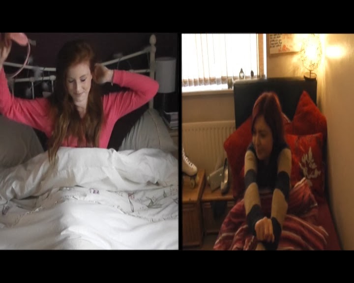
As you can see in the two images above, Charlotte in my media product dresses pretty similar the costumes used in Mean Girls. The use of pink / purple and bright clothing is a generic convention in teen angst films as it is a very stereotypically girly colour. The pink clothing connotes the characters popularity and this is apparent in both my media product and Mean Girls as both of the characters are categorised as 'popular' in their schools. The mid shot in the image from Mean Girls represents that character's girly side as she is doing her hair and make-up and this is also apparent in our film when both Grace and Charlotte are getting ready for school in the split screen during the title sequence, this is shown in the image below.


Grace and Charlotte getting ready


Candy Heron in Mean Girls

As you can see in the image of Candy Heron on the right, she looks quite similar to the main character Grace in our film. They both have red hair and are both very pretty, the red hair connotes that they are possibly trouble-makers or easy to fall in love with in a teen angst film and this is the type of representation that we were aiming for in our film with Grace, it is very stereotypical that the most popular girls in school are usually always the most attractive.


------------------------------------------------------------------------------------------------------------

Sporty Group

We include other groups such as the 'sporty' or 'athletic' group in our film to show a wide range of social groups. The audience will instantly recognise that these are the sporty 'lads' as when they're walking into the classroom they're messing about and talking quite loudly, and their social group is also apparent with the clothes that they're wearing. They're all wearing hoodies with sports related bags and this represents that they're part of the sporty group as this is stereotypically the type of clothing they would wear in other teen angst movies. This is obviously also apparent because they're all relatively tall and look quite 'fit' which shows they take part in sports in school.


Geeky group
This image is one taken from the title sequence showing the 'geeks' in the film. This is apparent by the fact that they walk in very quietly and don't talk to anyone else in the line, it shows that they're quite isolated and only care about their own progression in school rather than their social life. The audience will automatically see that this is the geek group and this is another thing that will make them feel more comfortable watching the film as they can relate and compare these characters to people in their school environment. The range of social groups in our film mean that more people can relate to our film either personally or from people that they see in school, and this means the audience is more likely to enjoy our film.

Wednesday, 22 January 2014

Evaluation Task 1 - In what way does my media product use, develop or challenge forms and conventions of real media products?


Film title

The top left image is taken from our final product and it shows our film title 'High Expectations'. In our original plan the film was to be called High Expectations as the original story was about  girl called Grace who got pregnant whilst still in school.The title was used to suggest the pressures of school and the expectations that her parents had of her, as she was a very smart girl in school with a promising future. However, when we decided to change the story we decided to keep the original title as it was fitting and still appropriate considering the change of storyboard. Now, the film is about Grace still ,but the story has changed, it is now about how about how Grace has extremely successful parents who put her under a lot of pressure to succeed in school and she doesn't want to let them. However, Grace is the most popular girl in school along with her best friend Charlotte,  and she doesn't live up to her full potential as she fears it will ruin her popularity. 

This is the main reasoning behind the fillm title 'High Expectations' - but this title also allows the audience to try and assume what the story is about and this allows them to feel more involved with the film. The serif font for the title is very conventional for the teen angst genre as the target audience is 13-18 year old girls and this is a font that is appealing to this particular audience and is commonly used in other teen angst movies. The title colour is another common convention in the teen angst genre, an example of a teen angst that uses the same title colour is Mean Girls. The colour pink is stereotypically a very girly colour and this is something that will attract the audience as well as imply what genre the movie is. We decided to use a pink title font and serif style due to research that we completed earlier in the school year. The colour pink, as mentioned before, is used in the title for Mean Girls, and the serif font is used in the title for Footloose. These are two very well known films and are hugely popular with the teenage audience we look to attract. So we decided to use both the serif font and pink coloured text for our title for these reasons.


Costumes and props

The top middle image represents the main characters and how they're introduced. This picture is a perfect representation of the two main characters as they are both shown in front of a large wardrobe packed with fashionable clothes. It shows that they care about their appearance and they try their best to get the latest clothes. It is also a stereotypical representation that girls are obsessed with fashion and their appearance which is another reason for this shot. The characters are introduced this way through a split screen (we got that idea from Bratz) and this allows us to introduce the characters at the same time while representing what they are like and what sort of lifestyle they live. Both the main characters Grace and Charlotte wear skirts when they arrive at school, this connotes that they like their legs which is showing the audience that they are confident in their appearance and this also represents their popularity as they think they look better than very body else in school. 

Charlotte is wearing a crop top when she arrives at school which is a fashionable / trendy item of clothing that many girls wear, so this is another thing that can relate to the audience and is a generic convention of the film as girls stereotypically obsess over fashion an this is shown in many other teen angst films (i.e. Easy A). The fact that the main characters dress very fashionably and confidently suggests straight away that they are the popular 'bitchy' girls in school; however this is just a stereotype that allows the audience to develop an opinion on the characters before anything is given away in dialogue. Our research earlier in the year allowed us to recognise the type of clothing / costumes that are used in teen angst films most commonly. In nearly all American teen angsts (Easy A, High School Musical for examplpe) the characters wear non-uniform clothing because most schools in America don't have school uniforms - or they're based in college. We decided to make our characters in sixth form meaning they also wore non-school uniform, the main reason for this was to make our film more like other ones we had studied.

Camera work and editing

The top right image is a shot representing camera work and editing in our product. An extreme long shot of both the main characters and this allows the audience to view the whole outfit of each character. We used editing to add in titles to make the shot more appealing as there is quite a lot of space behind them so we thought it would be a good idea to include titles to fill that space. We used a wipe transition so the title starts behind them and the wipes to the right of the screen, so it looks as if it is following them through the door, it makes the shot a lot more appealing. The extreme long shot allowing the audience to see the whole outfit of the characters is a generic convention of teen angst films and it is used commonly to portray the characters as their clothing can have a big impact on stereotypes etc. The image shows a pan shot that we used, it shows Charlotte catching up with Grace and then opening the door for her, it is a representation of her character and the type of relationship her an Grace have. We used editing techniques on Final Cut Pro (use of 'blade') which allowed us to trim shots and make them shorter as well as adding in titles which are apparent throughout the whole title sequence. 

Shots are generally quite short in teen angst films and the use of title is another generic convention as they are always found in the teen angst genre. Our research allowed us to realise that generally the shots in title sequences and opening scenes are quite long, as opposed to the rest of the film that uses quicker cuts. With this in mind, we didn't use too many shots in our title sequence / opening scene and so we had to make the most of them by keeping them on screen for longer than we may have wanted. In terms of the shots we used, most teen angsts use shots like close-ups, mid-shots and pan shots most often as they are most useful for different reasons. For example the long shot can be used to represent a character's whole outfit to the audience and this can help the audience start to make assumptions on the character's personality or role in the film - fitting stereotypes to each character - and long shots we use quite commonly in the opening of our film to assist that.

Title font and style

As you can see in the image in the middle left of the grid, we used a pink colour for the titles as it is a colour that appeals to the target audience and is commonly a colour found in teen angst film. The font style was a handwriting style font and this is a style that appeals to the target audience (13-18 year old girls). We originally had all of the text in a white colour and it was in a block styled sans serif font in our first draft, we noticed when watching it back that this was quite dull and it needed to be made more appealing for the audience, and that was the reasoning behind the change. We kept some of the titles white, but changed most of them to be pink so it offers a bit of variety and it isn't just repetitive.

We used pink and white for the colours of our titles as they are colour that appeal to the target audience and this is also a generic convention in the teen angst genre as many films of this genre use pink and white as primary colours for titles. The reasoning behind using two different colours were that some titles you couldn't see clearly due to the background so we had to make changes. We used a serif font called 'Coventry Apple' for the names in the titles as it is more conventional - the target audience (teenage girls) will appeal to this font more than anyone else. Other films tend to use serif font to appeal to the audience, for example: Dear Lemon Lima - which uses a similar serif font as well as the pink coloured text for their movie title. Dear Lemon Lima is one film we researched when looking at titles and this gave us the idea for our titles to be pink and serif font because it fits the genre more than any other colour and font style.


Setting and location

The middle centre image is a shot from our film that represents setting and location in our film. This particular shot is very effective in implying what the film is about, due to the setting and location. This shot shows one of the many different shots during the title sequence in both girls' houses. Due to the range of shots it makes the houses look very large and this links in with the storyline that Grace comes from a very wealthy family and a successful background. Another setting in the film is the school, which is shown in the middle-right image. Both the home setting and school setting are very common in the teen angst genre as these are the two places teenagers are most commonly found, this makes these two settings / locations generic conventions of a teen angst move; and this helps the audience understand what genre this film is during the title sequence and opening scene.

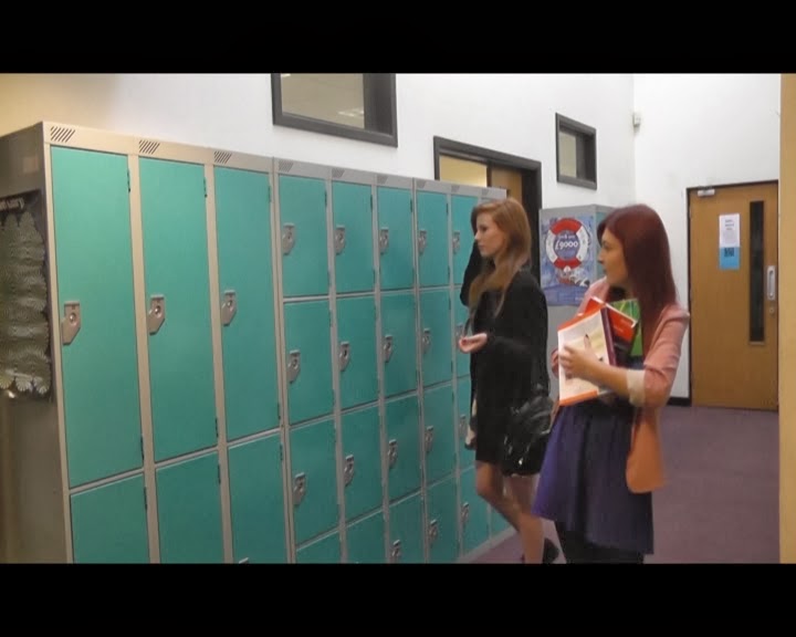
The school lockers is an example of iconography. This is because lockers are commonly found in a school setting and the audience will easily realise that the opening scene is in a school setting when they see the girls stood next to the lockers.Easy A is a good example again of setting and location, as the two main setting the in title sequence and opening scene of that film are the main characters bedroom and the school she attends, this makes it easier for the audience to realise her age group and the genre of the film, which is why we have also made home and school the two main settings / locations. When looking at all the films we researched such as Easy A, High School Musical, The Breakfast Clubs etc... they all include lockers as they are a typical object found in teen angst films as the main setting is school. The lockers therefore are iconography as the audience will recognise this and this also makes it a convention of teen angst.

Story and how the opening sets it up

The middle right image is an imported image from my film that is a representation of how the story is set up throughout the opening. In this shot, the main characters are stood outside the school lockers and Grace is throwing her books at Charlotte while emptying her locker. While this is happening non-digetic sound is used when Grace's voiceover is in the background. While Charlotte is struggling to hold the books being thrown at her by Grace, in the voicoever she says 'at lest I'm popular... right?' - this implies that she isn't happy with her relationship with Grace and her current situation at school but she really wants to be popular in school. This is a generic convention in teen angst films as there is always a 'popular' girl group in school and usually a girl who is seen as being on the outside of that popular group trying to fit in

The title sequence throws the audience off a bit as the split screen shows Grace and Charlotte being very similar and then when they arrive at school, Grace treats Charlotte more like a 'slave' than a 'best friend' - and this then sets the story up for the rest of the film and gives the audience a little insight of Charlotte's life through the use of voiceover as non-digetic sound. Our research helped us find that this type of scenario is quite common in the teen angst genre and a plot twist is also common in many teen angst films and that's what we tried use it straight away. The teen angst film 'Flirting' is another example of a film that involves a similar situation to ours, with the two female 'best friends' as the main characters who both attend the same school.

Characters and how they're introduced

The bottom left image is showing how the characters are introduced in the title sequence. In this shot you can see that the girls are doing their hair and make up which represents they are quite 'girly girls' and they come under the stereotype that teenagers care a lot about their appearance. The whole title sequence was based on introducing the characters through taking the audience through both of their 'morning routines'. At the start of the title sequence they are both in bed, which is a generic convention of teen angst movies and we have represented the two main characters as ones that fit the stereotype that teenagers are very lazy, hence the reason the audience see's them in bed. This is also connoted with the use of the alarm clock, as it shows they are possibly running late. 

When Grace wakes up from her sleep she instantly has a smile on her face and her body language in the way she stretches connotes happiness and cheerfulness; and this was done to represent her popularity in school. Whereas Charlotte wakes up quite differently and her bod language suggests she might be quite unhappy; and this opens up suggestions that she may be jealous of her 'best friend' which is a scenario commonly used in teen angst films, and something that the target audience may be able to relate to. This type of connotation is a feature of many teen angst films as a lot of teen angst films tend to start with the main character(s) getting out of bed and getting ready for school, and the use of body language is commonly used to represent their personality. These contrasts in body language is another thing commonly found in teen angst films - as they like to portray the characters very obviously through things like over-expression so the audience can understand more clearly, and this is the type of approach we wanted to use.

Genre and how the opening suggests it.

The bottom centre image represents how the opening suggests the film genre. The use of serif font in this shot is one of the many conventions that show the audience what genre this film is. Another is the non-digetic sound that is in the background throughout the title sequence and during this shot; the music is very upbeat and cheerful and is sung by a female which are two reasons from the song that suggests this again is a teen angst film, as these types of songs are commonly found in the teen angst genre. There is a lot f the colour pink in text (i.e. the titles and film title) - this is another convention for teen angst films and it suggests that the film is quite girly. 

The title sequence consists of the girls getting ready for school and doing their make up and this also immediately suggests the genre of the film as it is something that the target audience can relate to, which implies that the genre of this film is teen angst (as the T.A is 13-18 year old girls). Angus Thongs And Perfect Snogging is a teen angst that relates to ours in many ways; for example the main character wants more that anything to win the 'popularity contest' in her school, which is similar to Charlotte in our film as she is desperate to be popular and well known. This is another example of how we used research to make our film like other popular teen angst films in order to fit the genre.

Special effects

The bottom right image shows a shot in the film in which I used editing to include special effects (i.e. the arrow shape and the voiceover). The arrow was something that i hate to get off the internet and then transfer onto Final Cut Pro through the use of Photoshop and a memory stick. The use of shapes or various objects on the screen is very common in teen angst films as they make the appearance of the shot a lot more attractive. I edited in the arrow as an example of this generic convention and I used it to assist the voiceover so that it made sense. This is because in the voiceover Charlotte says 'Hi, i'm Charlotte' - when both characters were in the same shot. 

The voiceover is used to represent Charlottes frustration of always being pushed around and treated like a 'slave' by her 'best friend' Grace. We connote Charotte's unhappiness when in the voiceover she says 'at least i'm popular... right?' and this type of situation where a girl is jealous of her best friend is common in the teen angst genre and we wanted to use the voiceover to immediately imply the genre. Easy A contains a similar use of special effects as as in the title sequence / opening scene of that film there is a use of special effects to have certain shapes appearing on the screen whilst a voiceover is in the background as non-digetic sound.

Wednesday, 15 January 2014

High Expectations - first draft and audience feedback


Above is the first draft of our teen angst title sequence / opening scene on Youtube, which is still a long way from being finished and we still have a lot of editing to do. We started the editing process a lot later than everyone else but we are making good progress, so the final draft will be completed on time.


After presenting our first draft to the rest of the class in a media lesson, we received both positive and negative feedback to give us a good idea on what areas need improving and what areas were good. 
Positive responses from our film are as followed:
  • Good song choice and use of alarm clock sound
  • Good use of transitions on the titles
  • Clever use of a split screen to represent both personalities
  • It's easy to follow (audience easily notices who the main characters are and their social status)
  • Good representation of social groups
Negative responses from our film are as followed:
  • No voiceover
  • A line should be put in place to split the screens better at the beginning
  • It should be shorter (less than 2 minutes)
  • Use a more appealing colour and font on the titles
  • Include the production company logo and film title

Tuesday, 14 January 2014

Title sequence analysis

Title list:

Title 1: Victory films (production company logo)
Title 2: Starring
Production company logo
Title 3: Alice Willard
Title 4: Giorgia Barker
Title 5: Film crew
Title 6: Aimee Clements
           Zoe Brennan
Title 7: Edited by
Title 8: Josh Long
Title 9: Film Director
Title 10: Zoe Brennan
Title 11: Producer
Title 12: Aimee Clements
Title 13: Music and sound by
Title 14: Josh Long
             Tom Bennett
Title 15: High Expectations


In media lessons we looked at how titles appear in certain films such as Juno and Easy A which are both teen angst films as well. We decided to use a purple / pink colour for our titles as it is stereotypically quite a 'girly' colour.We also used hand writing styled font in order to make the title seem more appealing to the audience, as previously we had white coloured block-styled text for the titles and it wasn't very appealing - and didn't suit the style of film. We made the titles appear using the fade transition for the movie title. We also used a wipe transition for the rest of the titles.

Monday, 13 January 2014

Shot list

Shot 1
Shot 1: Mid Shot of Grace and Charlotte getting out of bed

Shot 2: Mid shot of Grace and Charlotte at their wardrobes.

Shot 4
Shot 3: Mid shot over the shoulder of Grace and Charlotte at their mirror / dressing tables


Shot 4: Long shot of Grace and Charlotte walking down the stairs and towards the camera

Shot 5: Mid shot of Grace and Charlotte walking out the door from the inside of the house

Shot 6: Long - mid shot of Grace and Charlotte walking out their front doors from the outside.


Shot 7
Shot 7: Extreme long shot of Charlotte catching up with Grace outside of school and opening the door for her.

Shot 8: Mid - long shot of students (different social groups) walking through the door of their media class


Shot 9

Shot 9: Long shot then pan shot of Grace and Charlotte getting things out of Grace's locker and then walking towards the camera and into their classroom.


Sunday, 12 January 2014

Making of my teen angst film

My group finished filming, as we had parts that we needed to film at school which me and Tom filmed. We did a load of short pieces of filming that can be put together to form our opening scene. Including when the main character Grace meets Charlotte in the school car park which we filmed a few times in order to get it from different angles to offer some diversity. For example, we used a pan shot to show them walking through the school front doors, then a long shot from inside the school of the same thing. We also filmed a group of students walking into a classroom, shortly followed by Grace and Charlotte who are still getting things out of Grace's locker. This again is showing the audience that Grace takes after her wealthy parents and believes she is better than everyone, therefore not really caring that she is late. We also filmed a pan shot of the whole class after Grace and Charlotte and entered, showing all the different social groups in that class, which is something the audience can relate to.

On Friday we started editing the footage we had filmed. As we only had an hour in the lesson, we transferred all the film from the camera's onto the mac and we started watching all the bits we had filmed. We spent the lesson choosing which shots we were going to use and deleting the ones we weren't. We also started arranging the shots so they are more in the correct order, but as the lesson was only an hour long that's all we had time to do.

We have now finished putting all of the shots in the correct order as well as cutting them all to make all the film as short as possible. We have also added the music i discussed in a earlier post ('Cut and Dry') and sound effects. We added the sound of an alarm clock at the beginning when the girls wake up as well as a song throughout the title sequence and opening scene as it sets a positive mood and this is common in teen angst films. We have made it so the volume of the song is reduced in the opening scene so that voice overs can be heard more clearly - however the music will still be playing in the background.We have split the screen in the title sequence so the audience can see both Grace and Charlotte getting ready in the morning - we got this idea from another teen angst film called Bratz.
We saw that they used a split screen to represent their main characters and we decided it would be a good way to introduce our main characters. It was also helpful for us as we have far too much footage and so by using a split-screen we can show both main characters getting ready at the same time. We are now in the process of adding in the movie title as well as all the credits, then we will add in the production company logo and the voice over before making finishing touches.


Thursday, 9 January 2014

My teen angst film (2)


Image of my storyboards


Originally, our film was going to be about a teenage girl who had recently become pregnant, which is an issue teenagers commonly witness or maybe even experience. However, we decided to change the overall idea of our film to something that would appeal more to the teenage audience. Now, the film keeps the original title 'High Expectations' however the plot is now completely different. Grace is the main character, and she has one friend called Charlotte. Grace comes from a wealthy background and her parents expect her to do very well in school, hence the title 'High Expectations' - which connotes the pressures of her position and teenage life which the target audience can relate to. However, because Grace's parents act as if they are better than everyone because of their wealth, it influences Grace's behavior in school and she acts as it she is better than everyone. Her friend Charlotte is more like a follower. She does everything for Grace, like holding her bag, doing her hair and make up etc and makes sure she always looks 'fabulous'. Charlotte hates being her 'follower' but know that is the only way she is to maintain her popular status in school. 

The image above shows the three storyboards i have constructed. Due to the plot change, we had to create a new storyboard for the title sequence and opening scene. In the new storyboard, the main character Grace (played by Alice) is woken up by her alarm clock and then starts to get ready for school as music is edited in. Once she leaves to walk to school, she meets her 'follower' Charlotte (played by Georgia) but walks past her really ignorantly almost ignoring her. Then the camera focuses on a class entering a classroom while Grace and Charlotte turn up a little late and get stuff out of Grace's locker. Grace empties her locker - handing things to Charlotte one by one expecting her to hold it all and then they enter the classroom. We use a range of shots in the title sequence and opening scene but close ups, mid shots, long shots and pan shots in particular.

In terms of costumes, we decided that all the students featuring in the film should wear clothes they normally wear, to keep it more realistic, as it is based in a sixth form or 'college'. We use school books, pens, paper and just general school equipment when we introduce a pan shot of the classroom at the end of the opening scene. We also use little mirrors and general make-up collection and obviously Grace has a handbag which she gets Charlotte to carry around for her most of the time. We considered a wide variety of locations but figured it would be more logical to just use two primary locations that are relatable to the audience too keep the story easy to follow. These two primary locations are Grace's house and the school, however there are short moments of footage in the school car park and hall ways.